


Creating a calm and peaceful environment in your home starts with the colors you choose. Colors have the power to influence mood, energy, and even how spacious a room feels. If you want to transform your living space into a soothing retreat, selecting the right calm colors is essential. In this post, we’ll share practical tips for choosing and applying calm colors that promote relaxation and comfort.
Why Choose Calm Colors?
Calm colors are typically soft, muted, and gentle on the eyes. They help reduce stress and encourage relaxation, which is why they are often used in bedrooms, living rooms, and other spaces where you unwind. Colors like soft blues, gentle greens, warm neutrals, and pale lavenders can create a tranquil atmosphere that feels inviting and restful.
Understanding the Basics of Calm Colors
Cool vs. Warm Tones
– Cool tones: Blues, greens, and lavender shades tend to have a calming effect because they remind us of nature like water and plants.
– Warm tones: Soft beiges, gentle pinks, and light browns add warmth without overwhelming the senses.
Saturation and Brightness
Colors that are too bright or highly saturated can be energizing rather than calming. Choosing muted or pastel versions of your favorite colors helps maintain a peaceful feeling.
Tips for Choosing Calm Colors for Your Home
1. Start with Neutral Foundations
Neutral colors like soft whites, light grays, and creamy beiges are excellent base colors. They create a versatile and calming backdrop that allows you to add subtle pops of softer colors without feeling cluttered.
2. Consider the Room’s Purpose
– Bedroom: Opt for soft blues, pale greens, or lavender to promote restful sleep.
– Living room: Warm neutrals with soft accents in blue or green can make the space inviting and peaceful.
– Bathroom: Light greens or seafoam blues evoke freshness and relaxation.
– Workspace: Muted blues or soft grays help improve focus without feeling too sterile.
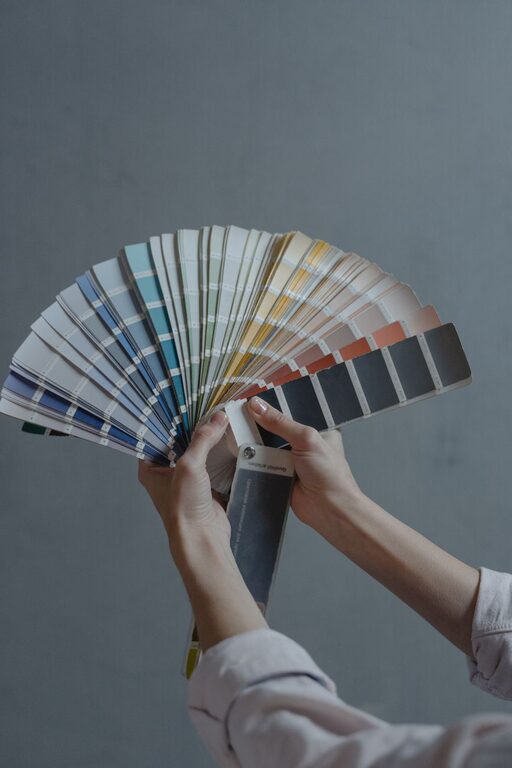
3. Test Samples Before Committing
Paint small patches on different walls and observe how the colors look throughout the day. Natural and artificial lighting can greatly affect how calm a color appears.
4. Use Color Psychology as a Guide
– Blue: Often associated with tranquility, blue’s soothing qualities make it a top choice for calm environments.
– Green: Symbolizing nature and growth, soft greens inspire serenity.
– Lavender: A subtle purple that promotes relaxation and creativity.
– Beige and taupe: Neutral and warm, these tones provide a cozy, calm feeling.
5. Balance Color with Texture and Materials
Calm colors perform best when paired with natural textures like wood, cotton, or linen. These elements enhance the peaceful vibe without overwhelming the senses.
6. Keep It Simple
Avoid using too many colors at once. Limit your palette to two or three complementary calm colors to maintain harmony and cohesion.
How to Incorporate Calm Colors Beyond Paint
Furniture and Fabrics
Choosing sofas, chairs, curtains, and rugs in calm colors reinforces your color scheme and adds comfort.
Decor and Accessories
Add throw pillows, art, or vases in gentle hues to introduce subtle variations without losing the calm atmosphere.
Lighting
Soft, warm lighting complements calm colors perfectly. Use dimmers, lamps, or candles to create a relaxing ambiance.
Common Mistakes to Avoid
– Choosing colors that appear calm on the paint chip but look too bright in your space.
– Overusing white, which can feel cold and stark if not balanced with warmth.
– Mixing too many colors and patterns, which can create visual chaos rather than calmness.
Final Thoughts
Choosing calm colors for your home is a thoughtful process that can greatly affect how you feel in your space. By considering your personal preferences, room function, and lighting, you can create a welcoming environment that helps you relax and recharge every day. Remember to test colors, keep your palette simple, and complement your choices with natural textures and soft lighting.
With these tips, you’re well on your way to designing a soothing home that feels like a peaceful retreat. Happy decorating!


More Stories